
an amusing typographical wedding invite, as pepijn (who sent me it) put it: charming… no idea who made it, if you do let me know…
an amusing typographical wedding invite, as pepijn (who sent me it) put it: charming… no idea who made it, if you do let me know…

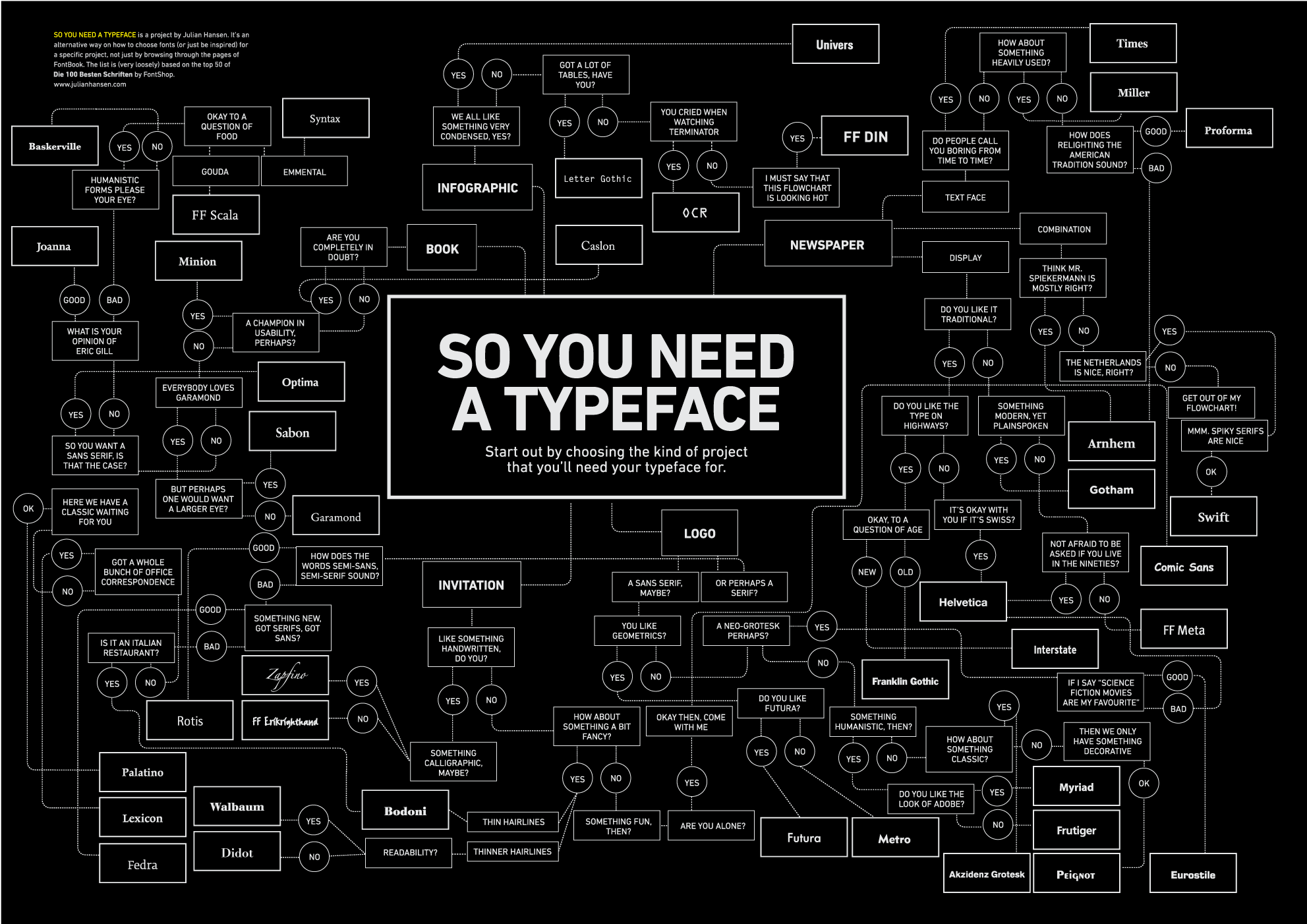
or do you find it diffcult to choose an appropriate font? this might help, although if you need a chart like this to choose a font, i would suggest going to study design & typography first…
volkswagen has very smartly adopted the colour blue, not green, for their own ‘green’ campaign and this little animation film attempts to get the point across using just symbols, no words…

like pretty much all other museums in amsterdam, the maritime museum is currently closed for extensive renovation, i just saw an artists impression of a rather striking feature which will be literally above the new courtyard: an enormous steel construction based on the old compass rose, let’s hope it looks as good as i’m imagining it will…


UK designers ‘johnson banks’ have been working on merging roman and non-roman typography for a while (most notably their ‘phonetikana’ project from several years back) this time they have turned their attention to mandarin chinese