
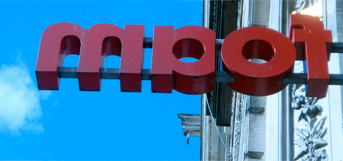
yet some more nerdy type from sicily, this time ‘squarish’ letters


yet some more nerdy type from sicily, this time ‘squarish’ letters

saw two shows this afternoon, both worthwhile… de appel is hosting michael borremans with some intriguing video installations and drawings (thanks to eric wie for the tip) and a collective show of amsterdam photographers in foam including several images from ‘alex ten napel’ taken from the ‘alzheimers’ book we made together (see ‘me work’)

here are some with ‘arched’ typography, on the lower one you can see how they make the drop shadow letters, the colour is painted on the back wall and there are transparent sections in the glass print… beautiful technique that doesn’t seem to be used anymore…

yesterday i went to pick up the framed print that wendelien had made for me, it’s the image from our ‘second life’ project (see ‘me work’) and it looks amazing… only i think we will soon need a bigger house…

