me news

doh

following on from my ‘simpsonsize me’ post last week… it seems i’m not the only one who couldn’t resist trying it, there are some pretty good ‘famous designer’ ones over on the CR blog

but why are those two blokes standing so close to my girlfriend with silly grins on their faces though?

m / 13-08-2007 12:58

redesigner #2

here’s another cover i’ve just made for the ‘serif’…one of my favourite books, the idea was born out of necessity: i only had one of each letter, but it suits the content of the book and the way brian eno pieces things together very well i think

m / 12-08-2007 13:50

redesigner

the serif asked for cover designs for books, i chose a novel ‘the dice man’ here are some of the rough sketches i made last night, the one below with a blue-ish background is the one i’ve sent to the serif

m / 12-08-2007 11:56

the ‘groovy’ era

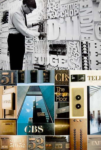
i came across some work by two of the undisputed masters of graphic design in the groovy ’70’s: the top images are from lou dorfsman, then creative director at CBS including a very baroque typographic wall…

below are various projects for ‘warner’ and ‘quaker oats’ amongst others by saul bass, he had a ‘rainbow phase’ apparently, as a kid the main thing i can rememeber from the early 70’s is too much of the colour orange, everywhere…

m / 10-08-2007 13:02

progress in work

I’m busy working on posters for several clients at the moment, including this one for a comedian

m / 10-08-2007 12:33